Chef Community Site
ui hugo
Role: UI & interaction design, development, usability testing.
Team: Shaun Yap, Web Marketing Manager // Hania Lisowska, Graphic Designer
Tools/Languages: Hugo, NetlifyCMS, Sketch
Problem
Chef’s website had only a single page dedicated to the community — no clear narrative existed. Each product mapped to a uniquely branded (and no longer maintained) website. The user journey was lacking, to say the least.
Before
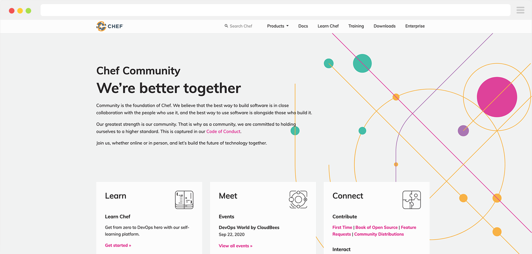
The page on chef.io consisted of a collection of shallow links to other landing pages. We wanted something more robust and less sterile.

After
- A new Community site built with Hugo and NetlifyCMS.
- Clear messaging and user journey for Chef practitioners: learn more about Chef, connect with other users, or contribute to Chef’s open source projects.
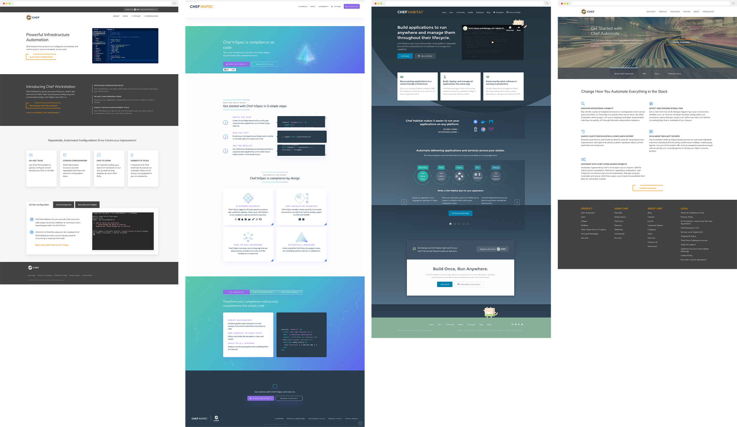
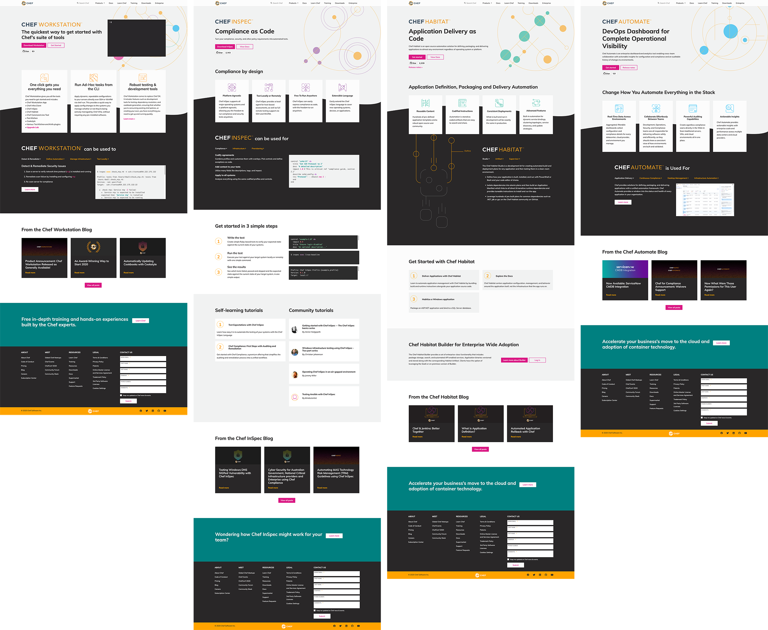
- Four product micro-sites were archived; each was transformed into a new page with consolidated branding.
- Chef’s passion for the community is properly reflected through improved content, whimsical branding, and a developer showcase.
Initial Research
We met with the Community team and envisioned a space where users could engage with one another through forums to develop their knowledge and interest in using Chef’s products. This led to an interest in personas, so naturally we took a peek at the community personas created by the UX team. This helped refine the tone and messaging; we wanted the Community site to serve the hands-on-keyboard operators in an IT organization.
Mapping the old
In addition to the flat blue webpage, there were four product sites, each with distinct branding and outdated content. Chef’s core product, Chef Infra, did not have its own site. We met with stakeholders from each of the products’ Engineering and Product teams to discuss how to retire these sites that were no longer serving their purpose, as well as creating New and Improved™ content.
Finally, we received feedback that the experience of getting from chef.io to the product sites and documentation was disconcerting.

Objectives
This initial research helped develop key objectives:
- Define clear journey for the end user (e.g., to learn, to connect, and to contribute).
- Consolidate the product micro-sites into a single web property. Create a new page for a product that never had a dedicated web property.
- Consolidate brand identity
- Drive engagement through consistent content updates, member spotlights, and more.
Process
Wireframing and Design
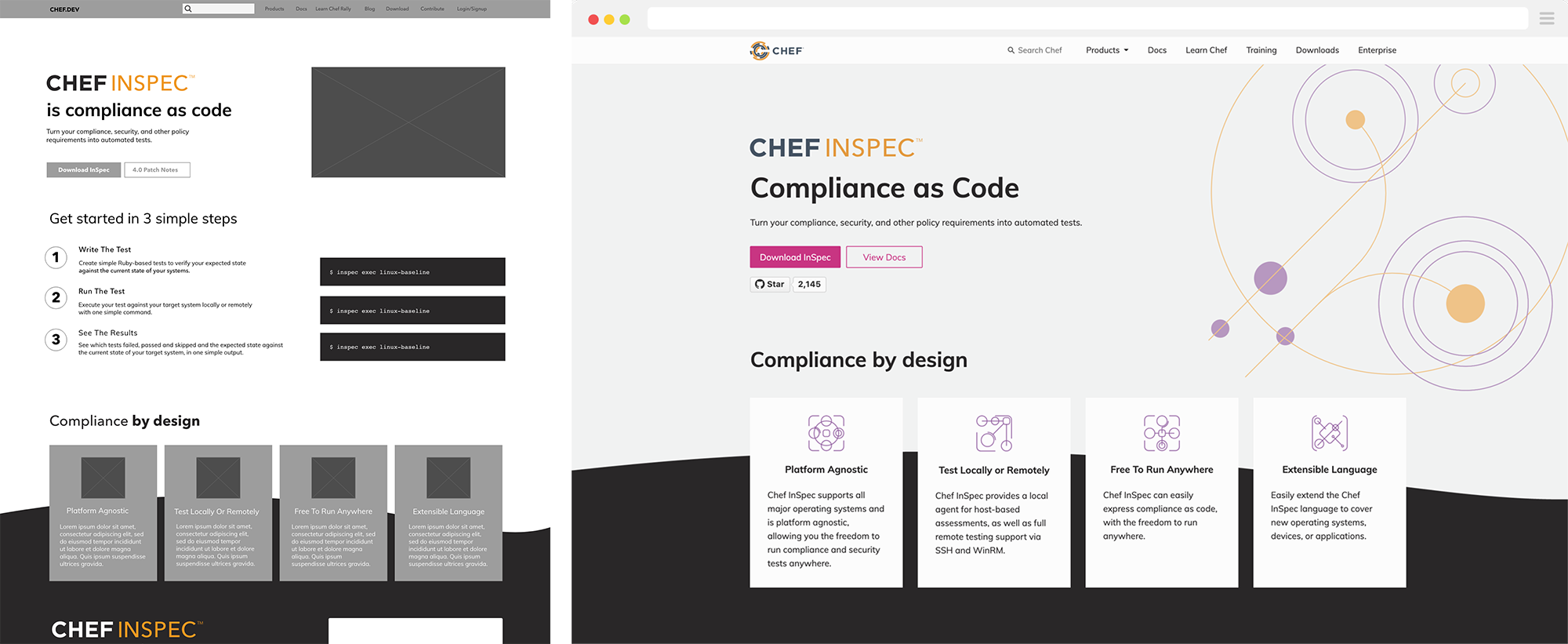
Once we were happy with the desired IA of the site, I began wire-framing for the existing content. As more actors became involved and more content was created, these basic sketches evolved into mockups that mapped out a journey.

Development
We were interested in a static site generator for its speed and ease of use; all site data could be loaded at build time. Hugo came on our radar by way of the Docs team — its popularity and simplicity was an added bonus. After looking through a few deployment options (including using Chef Habitat), Netlify appeared to be the most efficient deployment tool for our rather simple needs. Yet another bonus: NetlifyCMS is free and integrates with Hugo easily.
The result: a site that deploys in less than a minute with caching. The workflow enable non-technical teams within Marketing to author content.
Outcome
This was a significant project for our team. Although there were some challenges along the way with communication across departments, the final product was a huge win for multiple teams across the company.
Hugo was simple to learn and use. It was also a lot of fun to bring Hania’s art nouveau-inspired designs to life on the webpages.
